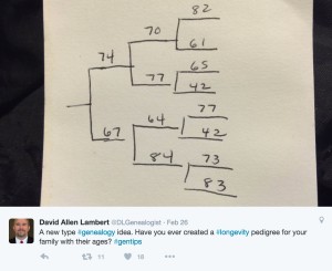
There’s a fun idea making the rounds of twitter and genealogy blogs in the last week or so. It started with a tweet by David Allen Lambert (@DLGenealogist) who sketched a pedigree with his ancestors’ ages at death on the back of a napkin.

I first read about it on the Genealogical Gems blog. Jeanne, the Genealogical Gems author, added cause of death to her longevity chart. I was captivated by such a simple, but revealing idea.
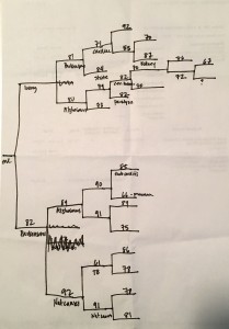
It took just a few minutes for me to grab a scrap of paper out of the recycling bin and sketch my own. It’s not the most beautiful document, but I didn’t get all perfectionistic about it. Here it is (click the image to get a better view):
It was a fun and useful exercise. Here are some of the things it revealed to me:
- My people tended to live a long time. (But I knew that already.)
- My ancestors tended to die from disease or old age, not accidents.
- I have Parkinson’s, Alzheimer’s and stroke on both sides of the family (though I bet that’s not too unusual).
- I haven’t noted the cause of death for a good number of my ancestors.
- I have yet to discover an ancestor who died in war.
- I have more death certificates to find!
I’m glad that David Lambert’s simple idea has become so popular, because I really enjoyed making mine!
Have you made a longevity pedigree? If so, what did it reveal?

