 This year, I’ve been focusing on one family line, the Adams line. I’ve been trying to gather as much information as possible not just on my direct-line ancestors (my focus in past years) but also on the siblings of my direct-line ancestors. It’s fun and fulfilling. But it’s also a bit overwhelming because there are so many people I can’t remember all of them.
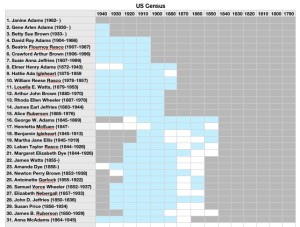
I keep track of everything in my family-tree software, Reunion. But I also like having an at-a-glance summary of where I stand in my research on each person. Three years ago, I created a progress chart, which had a series of tabs on a spreadsheet in which I marked the documents I had found on each of my direct-line ancestors. That worked pretty well and gave me an at-a-glance summary I craved.
I find myself wanting a similar chart for all my research subjects, including the collateral lines, and I’m struggling with getting my arms around that. Part of my problem, I think, is that I want to be able to see everything at the same time, which is challenging when your family tree’s branches stretch wide.
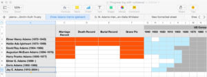
Here’s what I’ve settled on. I’m creating a single spreadsheet for all the data I’m looking for for each family group (B/M/D, censuses, newspaper, military, wills, land, etc.). In my previous progress chart, I’d had all my direct-line ancestors listed on each sheet, with a separate sheet for each type of data. In this new chart, I have all my data types across the top, with a row for each member of the family group. I have a separate sheet (a tab) for each family group. I decided to start with my parents in the first sheet and work back in time by generation.
I’ve spent a little time with it and I think it’s going to be really helpful. As I started filling it out, I paid attention to how it made me feel and I had two conflicting feelings:
- Overwhelm because there are so many people to enter into it and so many data types to research
- Excitement as I realized how many opportunities for research there are
I think the key to making this useful and not overwhelming is putting one family group on each sheet. That narrows the focus and allows me to see what I have and what I can still research. It also helps me avoid feeling overwhelmed.
Having each family group on a separate sheet makes it easier to fill out the chart initially as well. I ordinarily enjoy filling out forms and updating progress charts. But this one was so large it felt like it might turn into a big exercise in tedium. So if I take it one family group at a time, it feels like fun, not drudgery.
I’ll keep you posted. Once I have it in shape where I think it might be useful to others, I’ll blog again and offer to send it to anyone who might want to use it.
If you have a similar chart and/or have any suggestions for mine, please share in the comments. I’m all ears!

